import matplotlib.pyplot as plt

x = [1, 2, 3, 4]
y = [2, 4, 3, 5]

plt.plot( x, y,
          marker='o',
          markeredgecolor='red',
          markerfacecolor='orange',
          markersize=10
         )
plt.show()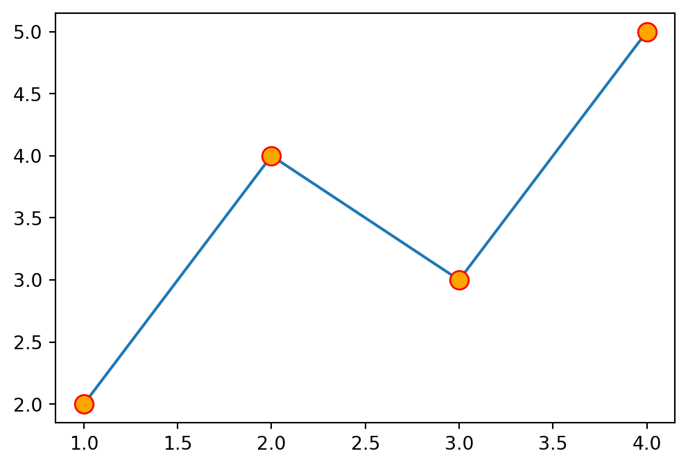
There is a tremendous amount of customization that can be done with PyPlot graphs. Two important style customizations involve the marker and line. The marker is the point that is plotted, and the line is the connection between points. See the PyPlot marker style reference and line style reference.
The most important customizations is the marker, but we can additionally set the colors and size:
import matplotlib.pyplot as plt
x = [1, 2, 3, 4]
y = [2, 4, 3, 5]
plt.plot( x, y,
marker='o',
markeredgecolor='red',
markerfacecolor='orange',
markersize=10
)
plt.show()
Some additional marker types include:
| Marker Type | Marker Code | Appearance |
|---|---|---|
| Point | '.' |
· |
| Plus | '+' |
+ |
| X | 'x' |
× |
| Circle | 'o' |
○ |
| Square | 's' |
□ |
| Pentagon | 'p' |
⬠ |
| Hexagon | 'h' |
⬡ |
| Diamond | 'D' |
◇ |
| None | '' |
(no mark) |
The main line customizations include which type of line, and what color to draw it with.
x = [1, 2, 3, 4]
y = [2, 4, 3, 5]

plt.plot( x, y,
          linestyle='-.',
          color='purple'
        )
plt.show()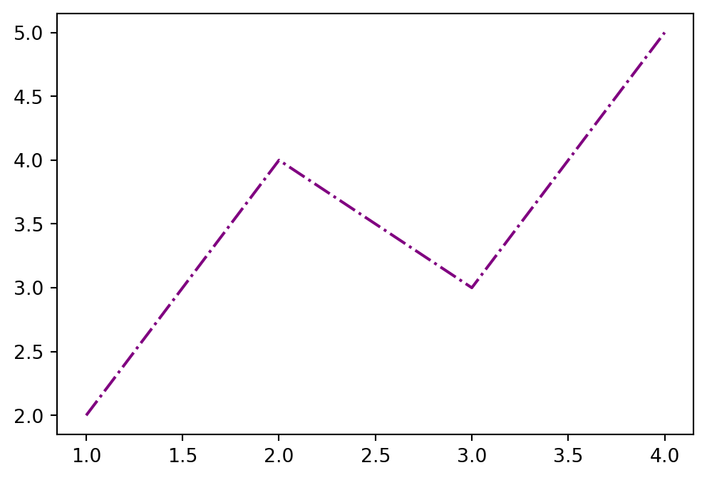
Some additional line styles include:
| Line Type | Line Code | Appearance |
|---|---|---|
| Solid | '-' |
───── |
| Dashed | '--' |
─ ─ ─ ─ |
| Dashdot | '-.' |
─ · ─ · |
| Dotted | ':' |
· · · · |
| None | '' |
(no line) |
It is best to write out the explicit attributes you are customizing, but there are some nice shortcuts for convenience. Plot red point markers with dotted line using:
x = [1, 2, 3, 4]
y = [2, 4, 3, 5]

plt.plot(x, y, 'r.:')    # Red, point marker, dotted line
plt.show()

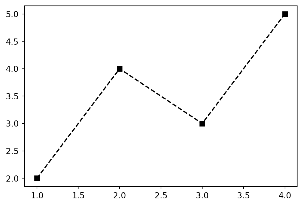
plt.plot(x, y, 'ks--')   # Black, square marker, dashed line
plt.show()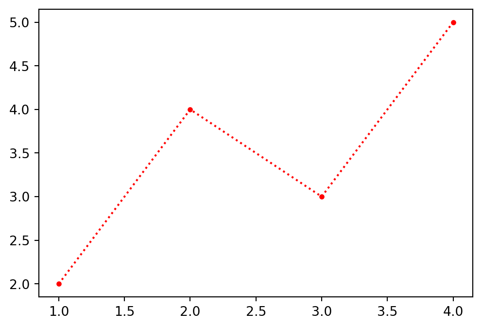
The matplotlib documentation offers several nice cheat-sheets that can be printed.
| Description | Python |
|---|---|
| Label \(x\) axis | plt.xlabel('X') |
| Label \(y\) axis | plt.ylabel('Y') |
| Title a graph | plt.title('My Plot') |
| Plot and label | plt.plot(x,y,label='series1') |
| Turn on legend | plt.xlabel('X') |
| Turn on grid | plt.grid() |
Graph the following data set as a scatter plot. On the same plot, draw an approximate best fit line to the data (this is an estimate).
| x | 0 | 1 | 2 | 3 | 4 | 5 | 6 | 7 | 8 | 9 |
|---|---|---|---|---|---|---|---|---|---|---|
| y | 12.5 | 13.1 | 13.2 | 13.2 | 13.8 | 14.1 | 15 | 14.8 | 14.9 | 15.1 |
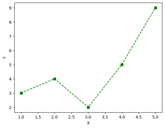
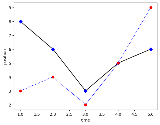
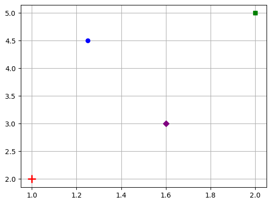
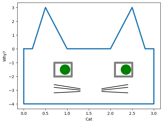
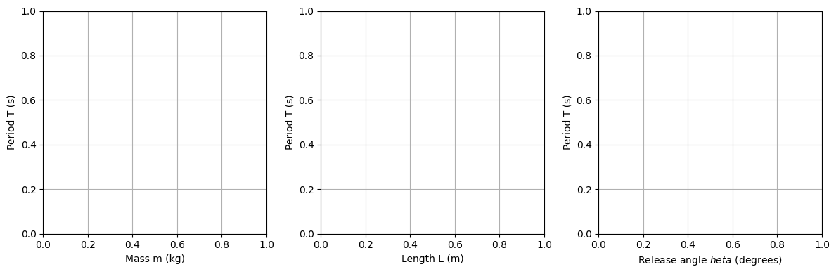
Recreate the following graphs as closely as you can: